Dashboards are graphical representations of data extracted from Preceda. This functionality provides a simple mechanism to present summarized data in a way which may support decision-making activity and provide additional reporting tools for managers.
Dashboards are displayed on the Preceda Home page as widgets or gadgets. Click on the Preceda or Company logo at the top left portion of the screen to go back to the Dashboards page.
You can link as many dashboards as needed to a module. Any changes applied on the dashboards being accessed from the module instead of Preceda main page will be saved and reflected on both (Preceda main page and the module main page) and vice-versa.
The chart of table will display data from a snapshot created at the end of the prior month. The snapshot is run overnight on the last day of the month, and your dashboard widgets will be refreshed from the 1st day of the new month.
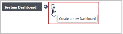
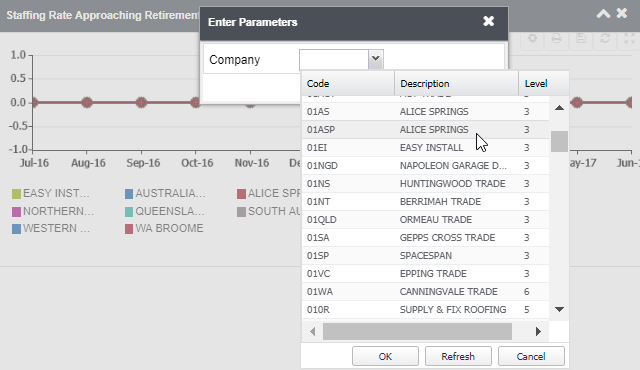
Standard Preceda Dashboard users can select 'C' for Costing Levels or 'O' for Org Structures so that the Dashboard widgets will display either costing or org structure data in the Parameters. It should be noted that if Organisation Units is selected, data is displayed from one unit only. Costing Level, on the other hand, can be renamed as follow:
System Name | User-Defined Name |
---|---|
Costing Level 1 | Company |
Costing Level 2 | State |
Costing Level 3 | Region |
Costing Level 4 | Location |
Costing Level 5 | Pay Point |
Department | Cannot be changed |
Account | Cannot be changed |
You can add one or more Dashboard pages to display the gadgets relevant to them.
When adding a new page, you can select from five different page layouts.
The Link to Module drop-down list allows you to link a dashboard with any of the available modules. The Show tab in main page check-box is ticked by default and can be disabled when a module is linked to it.
After saving the dashboard, you can change the layout using the Edit Page icon.
You can add one or more charts/ widgets to the Dashboard Page by clicking the Add Charts icon. A maximum of six gadgets can be added on each dashboard page.
You can also move the widgets and arrange them in the order desired.
For some widget types, you would need to select the Costing Level or Organisation Unit that the chart will display. Hover over to the top right portion of the widget in order to view the icons.
A pop-up will appear and you can select from the drop-down the Company. The information contained in this list will depend on the value selected in the Base Dashboards on Costing Levels or Organisation Units field on the Dashboard Options window.
You can also maximize the chart, print, refresh, and save the chart or table.
The following widgets are available:
This column displays the total active employees in a Division or Org Unit.
This column pertains to the average length of service in years for all active employees in a Division or Org Unit.
This column displays the average age of all active employees in a Division or Org Unit.
Clicking on a specific Division or Org Unit will display another table listing the next lower Costing or Org Unit levels under it.
Clicking on the numbers under the Headcount column will direct the user to the Personal window displaying information about the employees being pertained to.
This widget displays total count of employees in a Division or Org Unit depending on the employee status, i.e. Full Time, Part Time, Casual.
Clicking on the piece of the pie chart will direct you to the Personal window displaying information about the employees being pertained to.
This chart displays the total headcount in a division or org unit for each gender.
Clicking on the piece of the pie chart will direct you to the Personal window displaying information about the employees being pertained to.
This widget displays a rolling 12-month line graph which displays the ratio between the employees born before 1964 (Silent and Boomers) and the employees born after 1964 (Generation X and Y). The information is rounded to 2 decimal places.
Clicking on the Division or Org Unit will highlight the line graph that it pertains to.
This line chart displays the labour stability calculation, which constitutes the employee count for today's date divided by the employee count for last year's date, and multiplied by 100.
This pie chart displays the grouping of ages in a particular Division or Org Unit.
The groupings include:
This line chart displays the number of employees with unplanned absences for each Division or Org Unit. The parameters for this widget is set using the Work Hours Mapping window.
This line graph displays the Total Training Hours divided by the number of employees in a Division or Org Unit. The training hours referred to are those hours with a Classification of Q.
This line chart displays total terminations in 12 months, divided by the employee headcount for that period, and multiplied by 100. This will include both terminated employees and those who have been subsequently re-hired.
This line graph displays the headcount at end of the month for people aged 55 or over, divided by the total headcount for end of the month, and multiplied by 100.
This line graph displays the headcount of employees based on the number of terminations in the month, divided by the active employees at the end of the month, and multiplied by 100. Active employees by month include the hires in the calculated month.
Once the Analytics Module has been enabled, a group of Pre-defined Views such as Age Profile, Overtime Cost and Full-Time Equivalent are made available within the Widgets.
The Views listed and data presented depend on the Access Profiles and Security Profiles settings.
Please complete the form below to give us feedback. If you need any assistance with this functionality, please contact Preceda Support.
|
|
Version 15.3.01 Preceda Knowledge Base
For feedback and comments, please contact your Systems Administrator or Account Manager. |
![]() |
||
![]() |